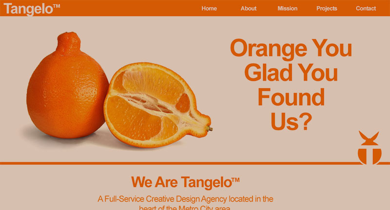
So this post isn’t about designing fruit – that’s way outside my area of expertise. It’s actually about the thoughts and process behind the design, layout and copywriting for Tangelo, the most recent addition to the E-Gallery Design site.
The initial idea was to create a simple, one-page site for a fun, creative interactive design company. The word “tangelo” came to mind, as it has a fun, lively ring to it, and the fruit itself seemed familiar, but also slightly unusual.
The first, main find was the picture of the Tangelo featured in the banner of the site, from which the main site colors were sampled. The main logo, a letter “T” inside a graphical representation of an upright Tangelo, was then designed using that image as reference to be added across the site as a unifying element.
The site sections were determined by taking all of the information and functionality necessary for the site and organizing it all into site-friendly presentation categories. Each section was then given its own visual treatment while staying within the established theme and color palette.
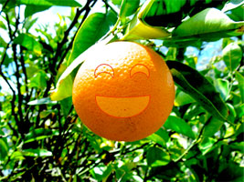
This little orange certainly looks happy
Initially, there was some doubt about using “Orange you glad…” as the slogan, since an orange isn’t a Tangelo. However, since it echoed the overriding color and contributes to generally playful theme and, since the “Mission Statement” image ended up being an orange as well, it all worked out.
Once the slogan was decided upon, its text was styled in a way that created an arrow of sorts to point down the page and keeping the viewer’s eye moving on to the rest of the site’s content.
The background was kept white, both to maintain clarity and to keep focus on the content. Adding in more orange color to the background seemed like too much, and a complementary color pushed things too far the other way.

The Tangelogo, in all its tangeloic goodness
However, having the entire site a combination of only two colors was a bit overwhelming, so two steps were taken. First, the text color was changed slightly to help it stand out on the page. And second, multi-color images were added to help break things up visually including, once populated, the thumbnails in the featured projects section.
The copywriting for this site was a lot of fun. The best was the copy for the Mission Statement section, which used double-meaning and metaphor to link tangelo, the fruit, with Tangelo™ the company.
In the end, I think that the design came out well. It feels fun but professional, with the concept and design supporting each other well.
Check out the final piece in the portfolio, and thanks for reading!